Expressive Text
Typography as meaning, not decoration
Scenario
Success as a designer depends on how well you design with type. Type will appear in almost every project, and often it is the project.
Words remain central to visual communication.
Type (in typography) refers to the visual design of text: font choice, size, weight, spacing, and alignment.
These choices shape how written information is perceived.
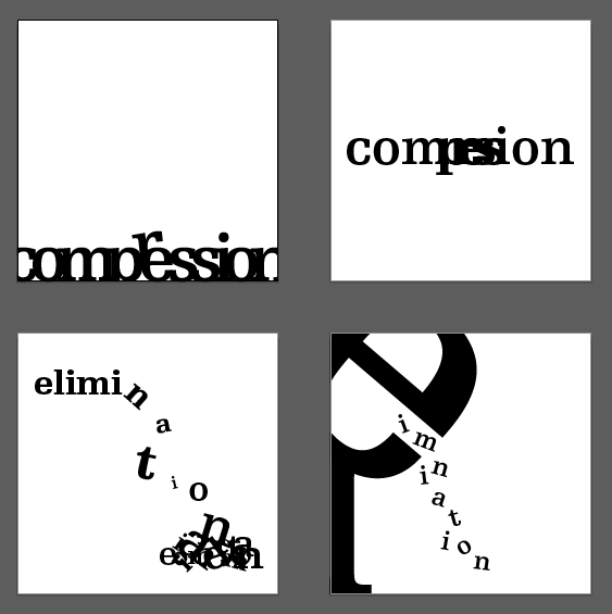
Task
Research the idioms below until you understand their meanings. Select four idioms and explore their expressive quality by manipulating letterforms.
- Do
use typography itself to carry meaning. - Do
consider contrast, scale, weight, spacing, rhythm, alignment, repetition, and disruption. - Avoid
simply repeating the word as a pattern. - Avoid
turning letters into literal illustrations. - Tip
Contradiction can be powerful: for example, setting the word “big” in very small type.
Deliverable: a set of four A4 posters (one idiom per poster).
What is an idiom?
An idiom is a word or phrase with a figurative meaning that differs from its literal meaning.
Idiom List
Miss the boat, The exception that proves the rule, Bated breath, On the ball, Great Scott, Bite the bullet,
A dime a dozen, Hit the sack.
Process
- Step 1
Research: Define each idiom clearly in your notes and collect 2–3 visual references per idiom (typographic, not illustrative). - Step 2
Select four: Choose the idioms you can express most clearly through type. - Step 3
Quick studies: Produce at least 6 thumbnail options per idiom exploring type size, weight, spacing, contrast, alignment, and pacing. - Step 4
Refine: Develop the strongest direction to a near final composition. Test different typefaces and micro spacing (tracking, leading, kerning). - Step 5
Final posters: Set each idiom on an A4 artboard (210 × 297 mm). Keep attention on the word, whitespace, and hierarchy. - Step 6
Export and submit: Export each poster as PDF (print quality) and PNG (screen preview). Name files as shown below.
Technical Specs
- A4 size: 210 × 297 mm (portrait)
- Margins: minimum 10 mm
- Color mode: work in RGB; export PDFs suitable for print if required
- Fonts: legal, school safe fonts only; embed or outline for print PDFs
- Images: none required; typography should carry meaning
Naming and Submission
- File names:
FirstnameLastname_ExpressiveText_Idiom-01.pdf/png
(and 02-04) - Upload: four PDFs and four PNGs, plus a single PDF of thumbnails
- Reflection: 2-3 sentences per poster explaining your key typographic decisions
Assessment Focus
- Concept: The typography enhances or cleverly subverts the idiom’s meaning.
- Craft: Control of hierarchy, spacing, alignment, rhythm, and contrast.
- Clarity: The word reads easily at a glance; details reward closer viewing.
- Iteration: Evidence of exploration before the final choice.
- Presentation: Clean files, correct naming, and on time submission.
Checklist
- I researched and defined each idiom.
- I chose four idioms with strong typographic potential.
- I created at least six thumbnails per idiom.
- My posters are A4 with consistent margins.
- My exports include four PDFs and four PNGs.
- I wrote a short reflection for each poster.
Professional conduct: Use school appropriate language and references. Keep your work original and cite any type specimens you study.