Adobe Illustrator · G12 Yearbook
Typography Foundations
Expressive Text · typography as meaning, not decoration
No Outlines Yet
Non-Destructive
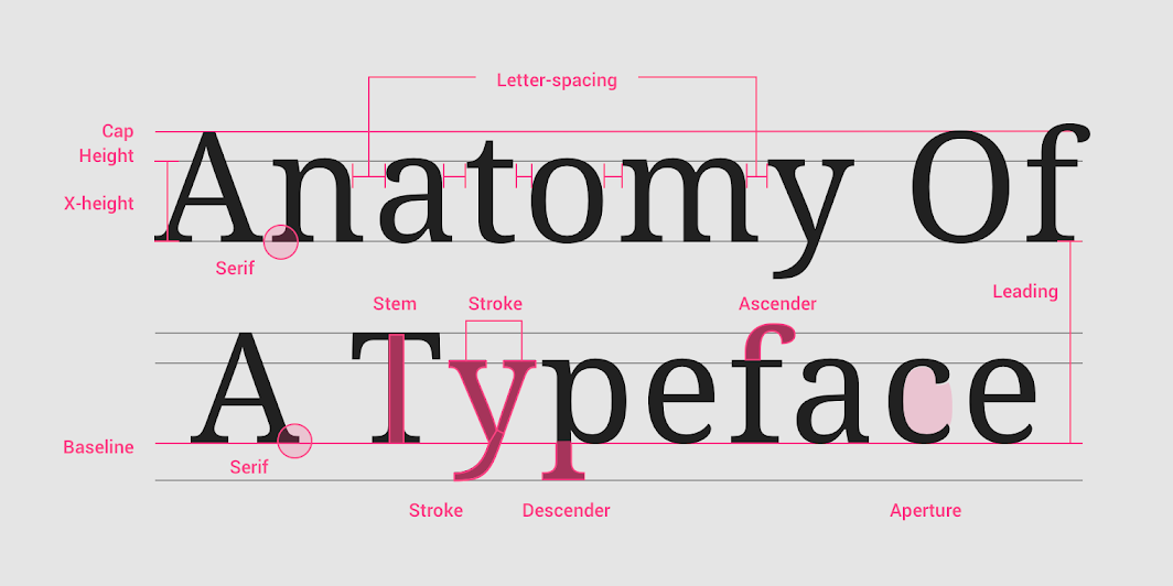
![]()
Open Adobe Illustrator → Essentials workspace → Window → Type → Character & Paragraph.
View → Smart Guides ✓, Rulers ✓ (Cmd/Ctrl + R).
- Create a new doc (A4). Type the word gravity once using the Type tool (T).
- Duplicate it twice (Alt/Option-drag). Pick three different fonts you already have installed.
Core Ideas
Readability = comfort in context
Hierarchy = visual order
Leading = line spacing
Tracking = overall spacing
Kerning = pair spacing
Tip
Headline type can use Optical kerning; long text often stays on Metrics.
Tool Focus (Illustrator)

- Moves or scales whole objects and text frames
- Aligns and distributes groups
- Macro layout tasks

- Targets anchor points and segments
- Edits handles and corners
- Micro shape edits (for later when we outline)
Why two arrows? V handles the “boxes” (text frames and shapes). A edits what is inside paths.
Today we stay in live type, so most work is V plus Character/Paragraph panels.
Setting Type Like a Pro
- Point vs Area Type: Click once with T for point type vs drag a box for area type. Resize the box to see reflow.
- Character panel: size, weight, leading, tracking. Kerning with cursor between letters + Opt/Alt + arrows.
- Paragraph panel: alignment, hyphenation, space before and after. Toggle Metrics vs Optical kerning.
- Guides and Columns: Drag guides from rulers to make a simple 4-column grid. Use Align to snap type frames.
- Save:
yourname_ExpressiveText_D1_v01.ai
Type Lab “gravity” Micro-Studies
Set it
Three versions of gravity in three different fonts. Keep them as live type.
Tune it
- Balance tracking for even texture
- Fix kerning pairs (watch gr, av, it, ty)
- If stacked, choose comfortable leading
Read test
Which version does your eye read first from 2 m away? Mark it: Version A · Version B · Version C
Look-fors (what “good” looks like)
- Smooth rhythm with no awkward holes or collisions
- Clear hierarchy between versions so one reads fastest
- Frames aligned to your guide system
Idiom Warm-Up (Live Type Only)
Pick two idioms. Produce one legible version and one expressive version using only type settings (no outlines).
Pro move
Try one solution that uses scale as the idea and another that uses spacing as the idea.
Exit Ticket
- In one sentence: when do you use Selection (V) vs Direct Selection (A)?
Homework
- Choose 6 idioms you might use in the project
- Write a one line meaning for each (your own words)
- Save 2–3 typographic references per idiom (no illustrations)
Reminder: Keep everything school appropriate and use legal fonts.
Next class (Day 2): cutting and dividing letterforms in Adobe Illustrator – Pathfinder, Shape Builder, Scissors/Knife, and when to Expand vs Create Outlines.